D
Deleted member 9
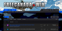
We have created four new themes, bringing us up to a total of nine thus far.
Three of the new themes are 'light', with the fourth being 'dark'.
There might be some minor tweaks left (such as for colour contrasting purposes), though, they're now ready to roll out as is.
To change to any of these themes, go to the bottom left of the screen, press the current theme name you are on (such as "FCW Midnight" ), and, you'll see the menu of choices available. For visual instructions on this, see here.
Screen shots of the previous themes are shown here and here.
Those were: FCW Midnight (default theme), FCW Arctic, FCW Lake View, FCW Maple Leaf, and, FCW Autumn.
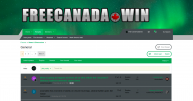
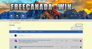
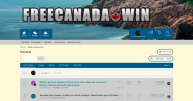
Screen shots of the four new themes are shown below (on Brave browser, 100% zoom setting, full-screen mode).
Please feel free to provide any feedback you may have.
FCW Northern Lights
FCW Rocky Mountains
FCW Atlantic Ocean
Three of the new themes are 'light', with the fourth being 'dark'.
There might be some minor tweaks left (such as for colour contrasting purposes), though, they're now ready to roll out as is.
To change to any of these themes, go to the bottom left of the screen, press the current theme name you are on (such as "FCW Midnight" ), and, you'll see the menu of choices available. For visual instructions on this, see here.
Screen shots of the previous themes are shown here and here.
Those were: FCW Midnight (default theme), FCW Arctic, FCW Lake View, FCW Maple Leaf, and, FCW Autumn.
Screen shots of the four new themes are shown below (on Brave browser, 100% zoom setting, full-screen mode).
Please feel free to provide any feedback you may have.
FCW Northern Lights

FCW Rocky Mountains

FCW Atlantic Ocean

Last edited by a moderator:

