With more members now need more sub forums - Hot, Rising, new?

Red-Pilled

A Pandemic of the Vaccinated
The position of threads don't seem to populate by their no of upvotes but by how recently they've been posted (pretty sure im using the default viewing settings. So it's super easy to not see threads that get slid down (particularly ones that were like posted 6 hours before).

It just seems like it needs more sub forums to keep pace with number of threads now. Maybe use the win format? Hot, rising , new ?

[Can you arrange threads so they're sorted by their post date, not when the last post on that thread was - or is that a change in the settings i do at my end]?

Don't get me wrong, you're doing a great job with this site.
 
Last edited:
Got you covered. See here.

:pcomfy

(It's easy to miss some of the features here. That thread covers many of them, but, even if you read it all a few times, probably will still forget about a few).

We have 'recent activity' (the default setting), 'popular' (hot), and 'newest'.

We don't have 'rising', yet. Maybe there is a way to include such an option.

There is something I would like to adjust with 'newest' though. I believe we should have it closer to the WIN format, where the only pinned/stickied threads which show up at the top of 'newest' are the ones which are actually really new. As is, our 'newest' sort puts all of the pinned/stickied threads at the top, regardless of how old they are.
 
Last edited:
Thanks, Conservationst Like a dummy, I never realized there was 'newest' and 'popular' options you could choose, I've literally just been made aware of them now.
I am dumb but I think they're not as instinctive as they were on say ThePatriots.

Maybe make those 2 buttons bigger/ coloured or different position on the layout for new dummies like me? I know you're busy but just a suggestion.
 
Last edited:
It's easy to miss!

We could try adjusting the sizes and/or colours. Good idea.

It might also be helpful to have it in two places (like the WIN network used to have, it looks like they've recently removed one of the two).
 
Last edited:
View previous replies…
For some reason in TD/ Patriots I was aware of those options the very first time I went there. Don't know if it was the colours , size or position of those buttons. I'll go back in there and try and work out what was more obvious about them and post here
 
@Red-Pilled Sounds good.

It could be a simple as we have more options displaying on the page, it's busier. As such, 'latest activity', 'newest', 'popular' can be lost in the fold.
 
@The Conservationist Of course on the win network - HOT, rising and New by default will bring newbies/people seeing those forums for the first time to those different categories which is popular (hot) and new (newest) ~ maybe "hot" and "new" can just be a filter switch when a user hits those tabs, rather than having to have different sub- forums if you catch my drift. I don't write code so I don't know if that's easy or not.

In other words, when a user hits the hot or new tabs (as on Win.)could it be written that the filter makes the selection for them automatically to view (popular or new) instead of the hassles for you having to have separate sub forums for those categories?
 
Last edited:
@Red-Pilled I think I understand you correctly, but if I do, then I think what you're suggesting is actually what it already does.

Currently, when you press 'newest' here at FCW, it'll sort all of the threads in the main page of 'General' in descending order of 'newest' to 'oldest' (with the cavaet that the pinned/stickied threads stay at the top).

Likewise with 'popular'.

That sounds like what you're looking for. Or have I misunderstood?

I don't write code so I don't know if that's easy or not.
The amount of coding we do for the forum is actually very minimal.

What you see is the XenForo 2.2 base software forum format, with a bunch of customizations made ontop of it.

Some of the customizations are the 'templates', some of them are new features we added (mostly via 'add-ons', which are usually already available for sale, or, we can ask a developer to create them for us), and some, require a tiny bit of code (like adjusting the symbols/colours of the thread flairs/prefixes).

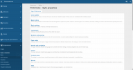
This is what the admin/mod back-end looks like (main menu for tweaking the 'FCW Arctic' theme):

Screenshot from 2021-09-09 16-21-48.png

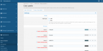
And here's what it looks like if we want to adjust some of the colours (within 'FCW Arctic'):

Screenshot from 2021-09-09 16-23-10.png

Point being, making changes isn't too difficult, once we figure out if they can be made (and how to do so).
 
@Red-Pilled We could possibly remove some of the less used tabs. On mobile it could be easy to miss too some of them are hidden in menus. I think if we lose some of the clutter it would help. Larger and more centered and in your face as well perhaps?
 
@Red-Pilled Yeah both of our backend admins (me and TC) use PC so sometimes we miss things on mobile only reason I ask. There are a lot of features and some we don't use, I have been trimming them back lately I don't think many people even notice I've removed quite a bit already.
 
Thanks. I had a look at Patriots/GAW , I didn't log in (didn't have my details to hand right now) so looking at it unlogged:
It's the hot,rising, new tabs top of screen in the middle that one automatically is drawn to. From memory when I was logged in I'm 99% sure I would just rely on those tabs to navigate the threads for me ie. Hot ~ popular New~ newest [Rising don't know what that equates to in your settings].

I know and am using the 'newest' and 'popular' tabs on this site now so it's no longer the issue for me but maybe for brand new people?

If other people/ new people don't have the issue, I don't want to create a lot of work for you that doesn't help
 
Last edited:
If other people/ new people don't have the issue, I don't want to create a lot of work for you that doesn't help
I'm sure it could help!

It's easy for us to forget about these things, and not notice them, as JP & I have been working on it for quite a while.

Recently got some feedback from an outsider-looking-in, to a similar effect. He caught something we had more-or-less just got 'used to'.

Much of it was on the to-do-list, just not particularly high on it. So, he's bumped it up.
 
Back
Top